
Project submission for FAPES funding calls
A submission screen for a long form, filled in by researchers on a tight deadline.
- My role
- Product Designer, solo project
- Context
- UX/UI take-home challenge for the LEDS selection process
- Tool
- Figma Make
- Status
- Working prototype completed
Context
This project was my UX/UI take-home challenge for the LEDS selection process.
Problem
The brief was to design the project submission screen for FAPES funding calls. FAPES is the research funding agency of the state of Espírito Santo, Brazil.
The deliverable had to be a single screen for a long form, filled in by researchers under deadline pressure.
My role
- I did the project on my own, from understanding the problem to the working prototype.
- I designed the filling flow, the interface, and the validation and help states.
- I built the high-fidelity clickable prototype in Figma Make.
Process
Because the form is long and the deadline matters, I split it into short steps on the same screen. The images below follow the order in which a researcher goes through them.
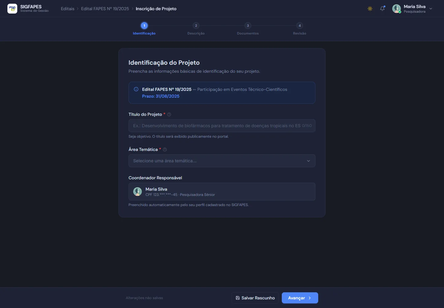
Step 1, Identification. The lead researcher is prefilled from the profile. 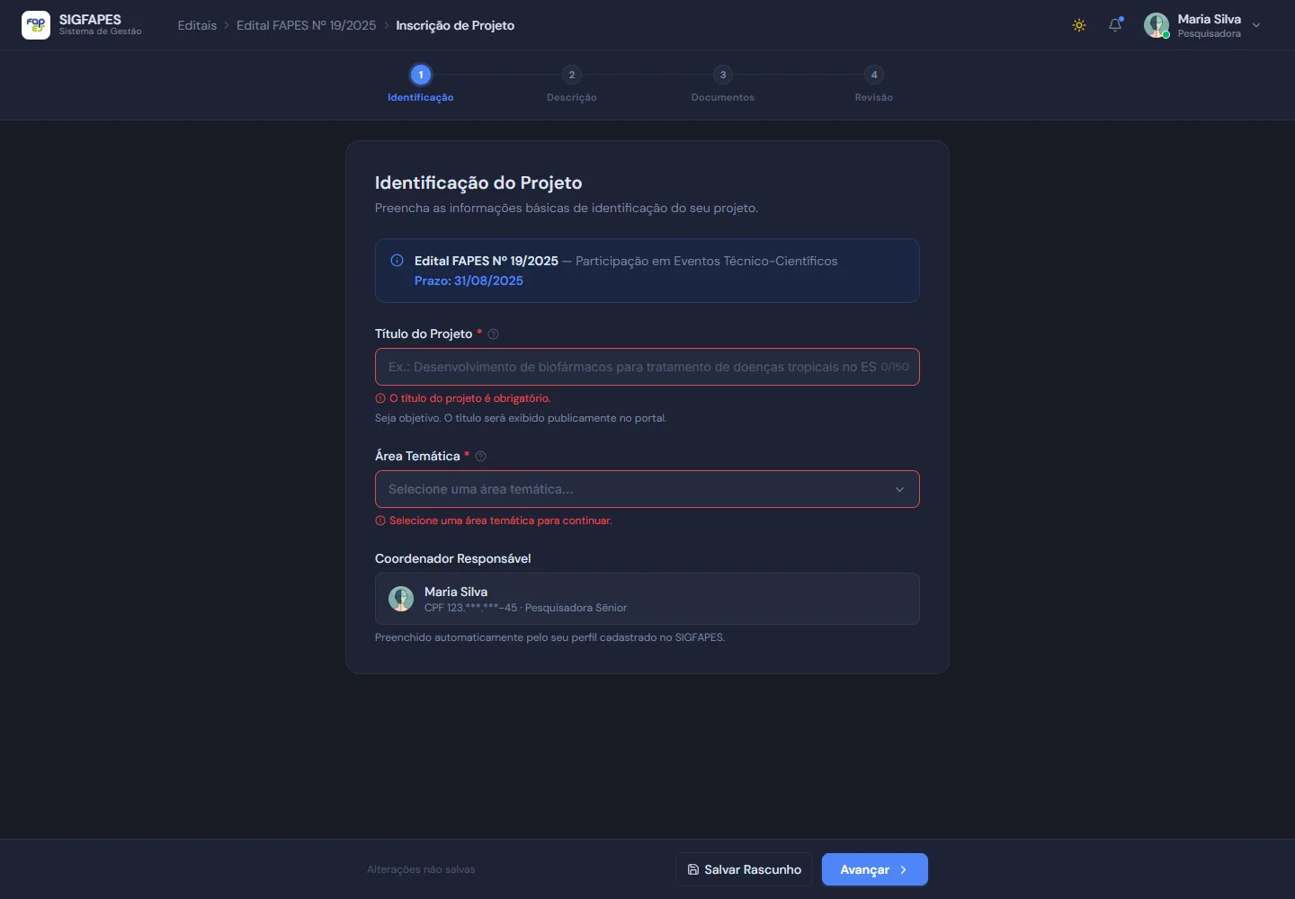
Inline validation that says what is missing. 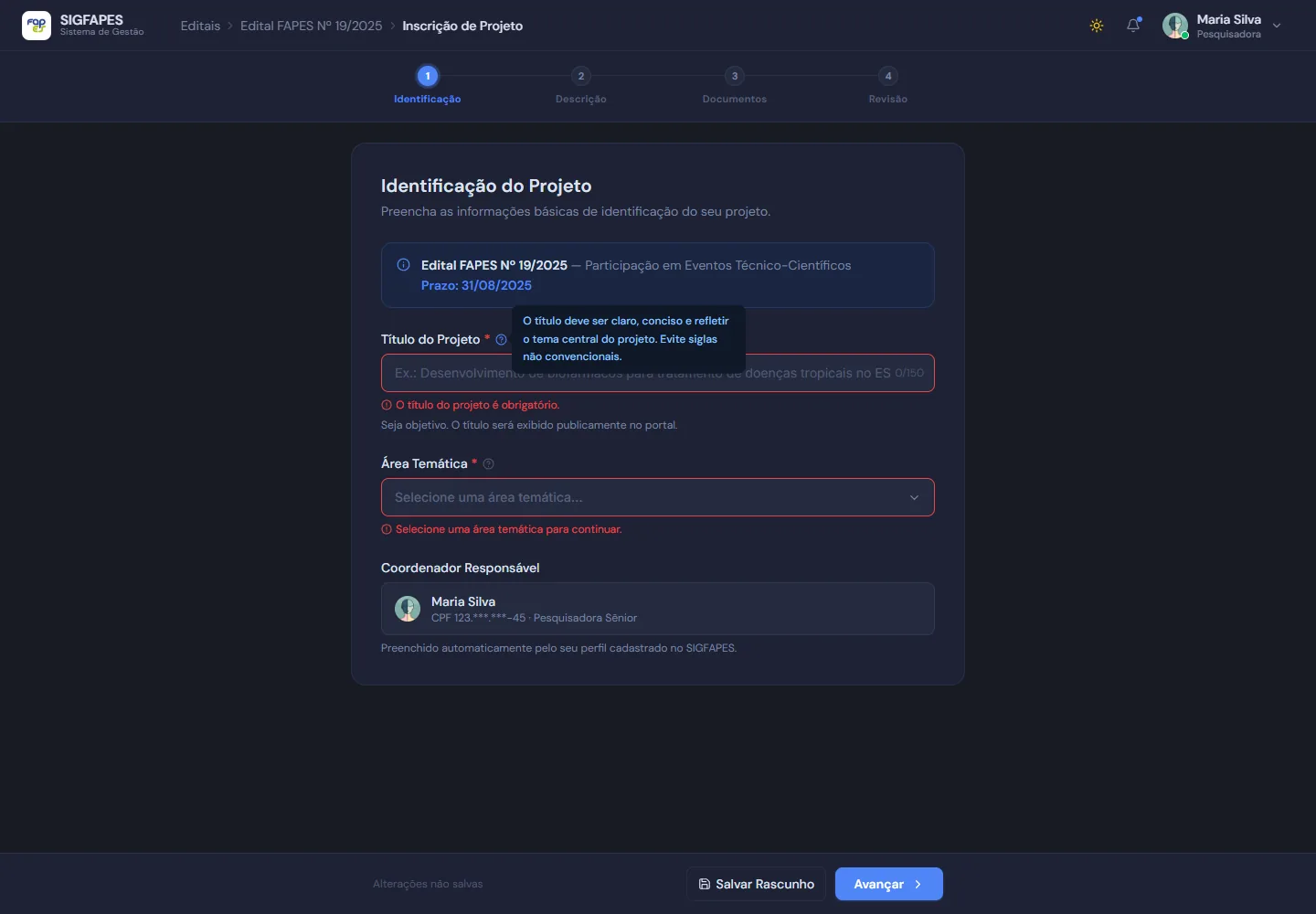
Help tooltips next to terms that usually raise questions. 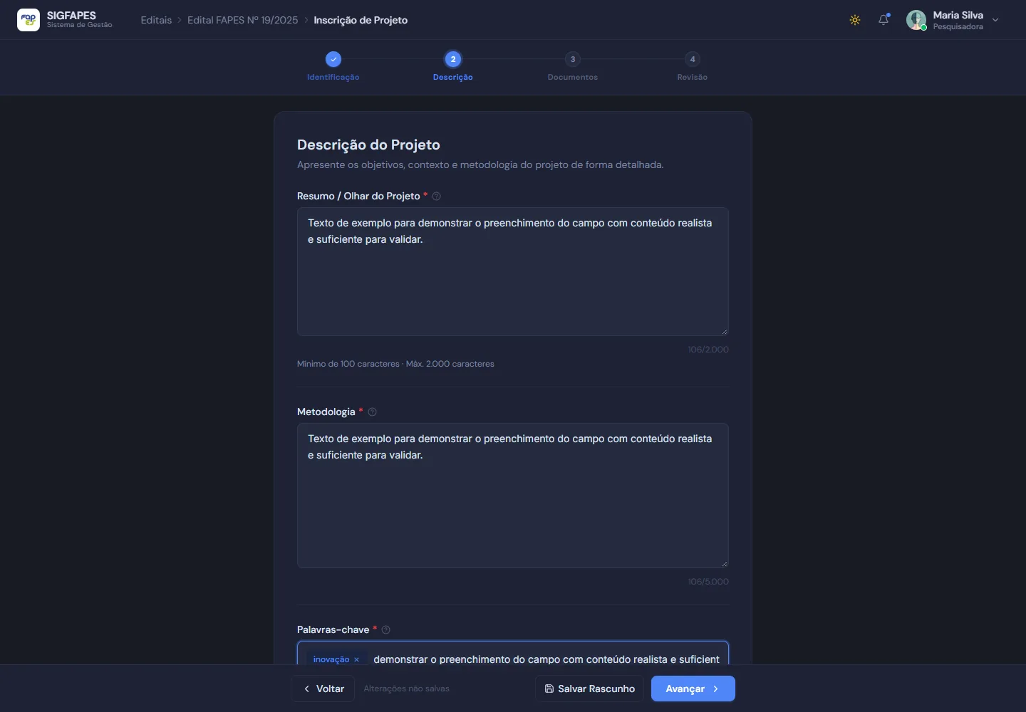
Step 2, Description. Summary, methodology and keywords. 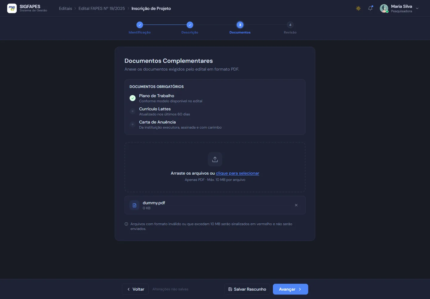
Step 3, Documents. The list shows what is uploaded and what is still missing. 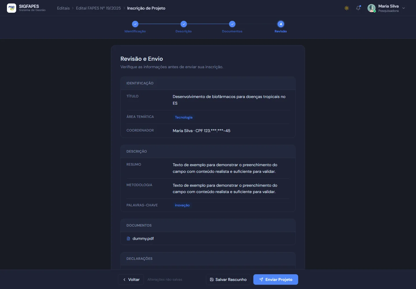
Step 4, Review. Everything filled in, before submitting. 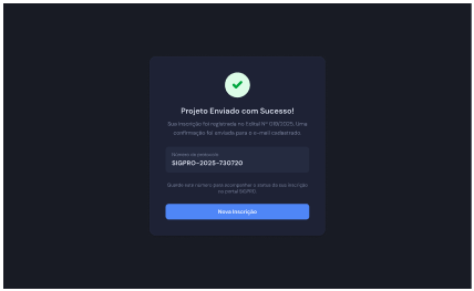
Confirmation with a protocol number. 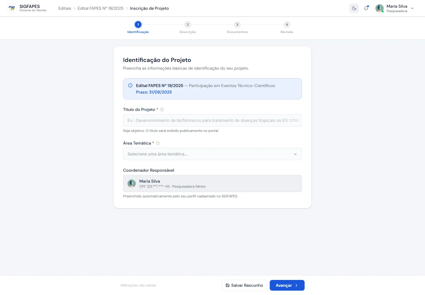
The same flow in light theme. 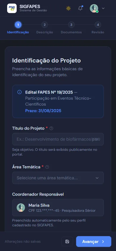
Mobile version.
Key decisions
A 4-step wizard on a single screen
WhyWith progressive disclosure, researchers only see the block they are working on and know how much is left. This avoids endless scrolling and lowers the cognitive load of a long form.
Signed-in user and prefilled data
WhyThe avatar with status in the navigation shows who is signed in, and the lead researcher's data comes prefilled. People on a deadline don't waste time typing what the system already knows.
Autosave, clear validation and in-context help
WhyAutosave (simulated in the prototype) protects the work of people who get interrupted. Validation points to the error in the field where it happens, and tooltips explain terms like "Methodology" without taking people off the screen.
Light and dark themes with tuned contrast
WhyEach researcher uses the mode they prefer. I tuned the contrast in both themes so text, fields and messages stay readable.
FAPES visual identity in the navigation
WhyThe FAPES brand in the navigation bar makes it clear that people are in the official environment of the funding call.
Outcome
A high-fidelity working prototype, clickable from the first field to the submission confirmation.
Status: Prototype completed.